
Ask a brand owner what went wrong with their first paper tube order and the answer is rarely the structure. It is the colour: the sample looked warm and soft, the production run arrived cooler and shinier, and the gap was big enough to hold up the launch. Colour drift between sample and mass production is one of the most common — and most preventable — problems in custom packaging. The cause is almost never carelessness. It is that the sample and the production run were never actually the same construction. This article explains where the drift comes from — paper stock, foil, lamination, lighting and the sampling process itself — and gives you a checklist to lock the colour before the run starts.
Colour Is a Set of Conditions, Not a Number
Most buyers treat colour as a property of the ink. In practice, the colour you see on a finished tube is the result of four conditions stacked together: the ink or foil that carries the colour, the paper stock underneath it, the finish applied over it, and the light the tube is judged under. Change any one of them and the colour changes, even though nothing in the artwork file moved.
This is why two tubes printed from the same file can look like different products. The file did not change — the conditions did. Once you accept that framing, colour control stops being a matter of trusting a supplier's eye and becomes a matter of fixing each condition in writing before production.
Why a Screen Proof Can Never Predict the Printed Tube
A PDF on a monitor emits light; a printed tube reflects it. Those are different physical processes, and no amount of screen calibration turns a backlit file into a reliable predictor of ink on paper. The gap is widest for saturated brand colours — a deep green or a coral that looks clean on screen will sit differently once paper fibres, coating and lamination get involved.
The same applies to proofs printed on office paper. An A4 print tells you about the layout, not about the tube, because it is on the wrong substrate with no lamination and no curvature. Curvature itself changes what you see: ink wraps around a cylinder under light that is never uniform, so the same artwork reads differently on a curve than it does on a flat sheet.
Treat every screen PDF and every flat printed proof as a layout check only. Colour can only be approved on the real construction.
The Paper Stock Decides the Colour Before the Ink Does
Paper stock is the single biggest source of drift, because the same ink behaves differently on every surface. We work with four stocks, and each pulls colour in its own direction:
| Stock | How it behaves | What it means for your colour |
|---|---|---|
| Coated art paper | Smooth, sealed surface that holds ink on top | Most predictable; vibrant colour prints and the tightest match to a digital reference |
| Natural kraft paper | Uncoated, with a warm earthy base tone | Inks sit on brown; whites and pastels shift warm and never cover the base |
| Metallic cardboard | Glossy, reflective surface | Adds its own shine; dark colours deepen and light colours pick up glare |
| Specialty textured paper | Peaks and valleys across the surface | Texture scatters light; colours read softer and darker than on smooth stock |
The mistake is choosing the stock after the colour has been approved. If the sample was made on coated art paper and the production run is quoted on kraft to save cost, drift is guaranteed — and no print adjustment fully closes it, because part of what you approved was the white base of the coated sheet, not the ink. Decide the stock first, then approve colour on that stock. Our blank paper tube page is a quick way to compare plain stock before committing.
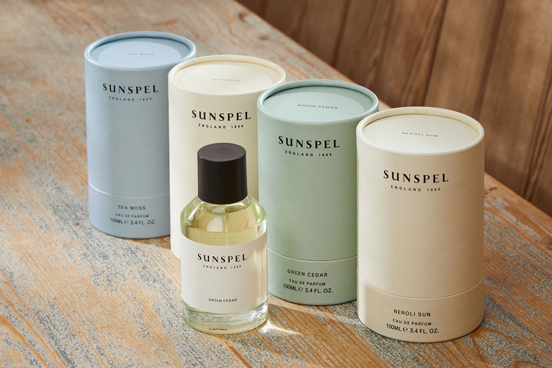
The photo above shows the effect plainly: one logo, one artwork, four base shades. The ink never changed — the stock did.
Why Gold on Screen and Gold Foil on a Tube Will Never Match
Metallic colour deserves its own section because it breaks the usual logic completely. Hot foil stamping is not ink — it is a metallic film pressed onto the surface with heat and a die. There is no ink recipe to match, so there is nothing for a screen preview to predict. Gold, silver, rose gold and holographic foils each come in their own shade ranges, and the final appearance also depends on the pressure of the die and the stock underneath: the same gold foil reads brighter on a smooth coated sheet and duller on a textured or kraft surface.
Holographic foil adds one more layer: it shifts with the viewing angle by design. If your reference is a flat render at a single angle, the production tube will look different from every direction — because that is what the material does.
None of this makes foil risky. It means foil must be approved as a physical swatch on the real stock, never as a screen colour. If your brand gold has a Pantone reference, say so at enquiry stage — the foil can be selected to sit closest to it, but it will always be a film with its own shade, not a printed match.
How the Finish Changes the Colour You Already Approved
Finishes are chosen for feel and durability, but every one of them also edits the colour underneath. This is the drift buyers notice most, because it happens after the artwork has already been signed off:
| Finish | What it does to colour |
|---|---|
| Matt lamination | Non-reflective; colours read deeper and slightly more muted, with a soft premium look |
| Glossy lamination | High-shine; colours read brighter and more saturated |
| Soft touch | Velvet-like feel; gently desaturates colour and softens contrast |
| Varnishing | Protective clear coat; the effect follows the varnish, gloss or matt |
| UV spot | Selective high-gloss areas; on a matte background the same ink reads as two colours |
| Embossing | Raised texture catches light; the raised area appears lighter at some angles |
| Debossing | Indented texture holds shadow; the recessed area reads darker |
Spot UV is the clearest example. Put a gloss spot over a logo on a matte-laminated tube and you have deliberately created two versions of every colour it touches. That contrast is the point of the technique — but it should be a decision, not a surprise at delivery.
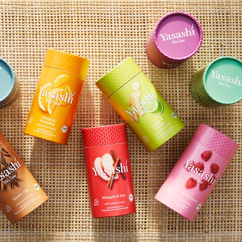
Full-coverage artwork raises the stakes further: large solid areas amplify any difference between ink batches and between viewing lights, which is why solid wraps drift more visibly than small logo-only prints.
The Prototype Is Not the Production Run
Even with the stock and finish fixed, a prototype and a production run are different events. A custom printed prototype is usually produced as a short run — sometimes on a different press, sometimes with a hand-adjusted ink, sometimes finished by hand. The production run uses its own ink batch, its own press setup and its own operator. Any of those can move the colour slightly.
That is not a defect; it is how manufacturing works. What matters is knowing which process each sample came from. When you approve a prototype, ask directly: is this printed the same way the production run will be printed? If the answer is no, ask for a proof from the production press, or accept in advance that the run may differ slightly from the prototype.
One more trap is worth naming: artwork changes between prototype and production. If the dieline moved — a panel shifted, a wrap adjusted — ink coverage changed too, and coverage changes how a colour reads. Freeze the artwork before you approve the colour, not after.
Light Is the Variable Nobody Writes Down
The same tube shows three different colours under daylight, office lighting and a shop spotlight. Warm retail lighting flatters kraft and gold; cool daylight exposes the gap between two whites. In our experience most colour disputes are, at least in part, two people judging the same tube under different light.
The fix costs nothing: agree how the colour will be judged before samples exist. State the light source — a standard daylight booth is ideal, a consistent window is a workable substitute — and judge the tube side by side with the approved sample, not next to a screen. Name who has final sign-off too, because “looks fine to me” and “looks off to me” can both be true under different light.
What to Put in Writing Before the Run
Every item below is one sentence in an email. Together they remove nearly all the room colour drift has left:
- Name the stock — coated art paper, natural kraft, metallic cardboard or specialty textured paper, not simply “white” or “brown”.
- Name the finish and where it goes — lamination overall, plus which areas receive spot UV, emboss, deboss or foil.
- Name the foil — colour, and whether a Pantone reference exists for it.
- Approve colour on a physical proof made on the production stock, not on a screen or a flat office print.
- Ask how the proof was produced — and whether it matches the production press route.
- Agree the judging conditions — light source, and comparison side by side with the approved sample.
- Name who signs off the colour, and keep one sealed approved sample to refer to at delivery.
These decisions also shape the quotation: each finish and foil carries its own setup, so fixing them early keeps quotes comparable — our pricing guide shows where they land in the cost structure, and our MOQ guide explains why decoration choices affect the minimum quantity.
If colour is central to your brand system, it is worth raising at the design stage rather than the sampling stage. Our article on designing custom paper tube packaging covers how artwork and structure decisions sequence together.
What Cannot Be Fixed — and What to Decide Instead
Some drift is not a defect but a property of the materials, and it is better to say so plainly. Foil on kraft will never read as bright as foil on a coated white sheet, because the brown base shows through the film. Soft touch will always mute a saturated colour slightly — that is the trade for the velvet feel. Holographic foil changes with the angle because that is its purpose. Textured paper softens every colour because the texture scatters light.
When a buyer asks us to make the foil brighter on kraft, the real question is usually not the foil — it is whether the stock should change. That is a design decision, and it is far cheaper to make before sampling than after the run.
So decide which matters more: the natural character of the stock, or the exactness of the colour. In most projects you can optimise one of them, not both. Brands that accept this early get both a distinctive pack and a stress-free approval process.
How Colour Approval Works in Our Process
Our process is built to make these decisions visible before production, not after delivery. Once dimensions are confirmed we provide a professional dieline so artwork sits exactly where it should, and artwork goes through pre-press proof approval before the run begins. Stock samples are free if you want to feel the paper before choosing; custom printed prototypes are available for final approval. Production runs under ISO 9001-certified quality control, printed with soy-based inks as standard on FSC-certified paper.
What we ask from you is the other half of the system: name the stock, name the finish, approve colour on the real construction, and tell us who signs off. Colour consistency is a shared process. The brands that get it right treat the approved sample as a specification, not a souvenir — and they rarely have a colour dispute again. For a fuller comparison of premium surface options, see our guide to luxury paper tube packaging.
Frequently Asked Questions
Why does my printed tube look different from the PDF?
A screen emits light and paper reflects it, so a PDF is a layout check only. Colour can only be judged on a physical proof made on the production stock.
Can you match a Pantone colour exactly?
Pantone references give inks a clear target. Foils are different: a foil is a metallic film with its own shade, selected to sit closest to your reference.
Which paper stock shows colour most accurately?
Coated art paper. Its smooth sealed surface holds ink predictably. Kraft shifts colours warm, metallic board adds shine, textured stock softens them.
Why did spot UV change my colour?
Spot UV adds gloss to selected areas only. On a matte background the same ink reads as two colours — that contrast is the intent of the finish.
Should I approve the prototype or a production proof?
Approve colour on a proof printed the way the run will be printed. Ask directly how the prototype was produced before you sign off.
What should I send with my enquiry to avoid drift?
Your artwork, a Pantone or physical colour reference, and your preferred stock and finish. We provide a dieline and pre-press proof approval before production. Answers to more practical questions are on our FAQ page.
Lock Your Colour Before the Run
Send us your artwork, a Pantone or physical colour reference, and your preferred stock and finish. We will confirm the construction, provide a dieline and arrange pre-press proof approval before production.
Request a Quote